Building an Interactive Resume with Plotly
2021, Dec 28
Below is a brief guide to create an interactive resume in Python to showcase on your website. Use this to display your work timeline and add to it as you see fit!
Import the required Python libraries
import plotly.express as px
import pandas as pd
from datetime import datetime
import matplotlib.pyplot as plt
Build the Interacticve Resume
present = datetime.today().strftime('%Y-%m-%d') #Use if this is your current job

#Create a pandas dataframe for each job, Task can be company or job title--it will become a tooltip when cursor hovers over era of timeline
df = pd.DataFrame([
    dict(Task="job_1", Start='yyyy-MM-dd', Finish='yyyy-MM-dd', Resource=1),
    dict(Task="job_2", Start='yyyy-MM-dd', Finish='yyyy-MM-dd', Resource=1),
    dict(Task="job_3", Start='yyyy-MM-dd', Finish='yyyy-MM-dd', Resource=1),
    dict(Task="job_4", Start='yyyy-MM-dd', Finish=present, Resource=1) # Finish = present denotes current job
    #keep adding jobs until your timeline is complete!

])

fig = px.timeline(df, x_start="Start", x_end="Finish", y="Resource", color="Start",
hover_name = "Task",  width=900,
                  color_discrete_sequence=px.colors.diverging.delta
                  , opacity=.7
                  , title="Interactive Resume: Work History" #change the title of your interactive resume
                    ,hover_data={"Start": False,
                              "Finish": False,
                              "Task": False,
                              "Resource": False}

                  )

fig.update_layout(

        showlegend=False
        ,yaxis_visible=False
        ,yaxis_showticklabels=False
        ,paper_bgcolor="#FFFFFF"
        ,plot_bgcolor = "#FFFFFF"
        ,xaxis = dict(
        showgrid=False
        ,rangeslider_visible=False
        ,side ="bottom"
        ,tickmode = 'array'
        ,ticks="outside"
        ,zeroline=True
        ,showline=True
        ,ticklen=20
        ,tickfont=dict(
            family='Serif',size=22,color="#100700")),
        hoverlabel = dict(
            bgcolor="white",
            font_size=16,
            font_family="Rockwell")

)

fig.update_xaxes(range=['df.Start.min()', present]) #create the timeline range of your interactive resume

#current or last job details, here Start and Finsih need to be in 'yyyy-MM-dd' format denotes start time of current/last job
fig.add_annotation(ax=0, ay=-200, #ay to change the height distance of text away from the timeline
                   x = pd.Timestamp('Start') + (pd.Timestamp(present) - pd.Timestamp('Start'))/2, y = 1.4, #center the text
            text="your job title or company you work for", #text that will appear above the era of the timneline
            arrowhead=6,
           arrowsize=2,
           arrowwidth=1

                   )

#add another job, Start and Finsih need to be in 'yyyy-MM-dd' format denotes start time of job
fig.add_annotation(ax=0, ay=-100,
                   x = pd.Timestamp('Start') + (pd.Timestamp('Finish') - pd.Timestamp('Start'))/2, y = 1.4,
            text="your job title or company you work for",
            arrowhead=6,
           arrowsize=2,
           arrowwidth=1

                   )
#add another job, Start and Finsih need to be in 'yyyy-MM-dd' format denotes start time of job
fig.add_annotation(ax=0, ay=-150,
                   x = pd.Timestamp('Start') + (pd.Timestamp('Finish') - pd.Timestamp('Start'))/2, y = 1.4,
            text="your job title or company you work for",
            arrowhead=6,
           arrowsize=2,
           arrowwidth=1

                   )
#add another job, Start and Finsih need to be in 'yyyy-MM-dd' format denotes start time of job
fig.add_annotation(ax=0, ay=-75,
                   x = pd.Timestamp('Start') + (pd.Timestamp('Finish') - pd.Timestamp('Start'))/2, y = 1.4,
            text="your job title or company you work for",
            arrowhead=6,
           arrowsize=2,
           arrowwidth=1

 #keep adding annotations until your timeline is complete

 fig.show() #check out your interactive reusme!
Publish it to your website using Plotly Chart Studio
Step 1: Create or login to Plotly Chart Studio
Step 2: Install Chart Studio
pip install chart_sutdio
or
$ sudo pip install chart_studio
Step 3: Upload your interactive resume to Chart Studio
 import chart_studio
 import chart_studio.plotly as py
 username = 'your user name'
 api_key = 'your API key'
 chart_studio.tools.set_credentials_file(username=username, api_key=api_key)
 py.plot(fig, filename= 'fig',auto_open=True)
Step 4: Share your figure, send it as a link, embed it into your own website
Your interactive resume will now have a link that you can share
Embed that link into an iframe
<iframe width="900" height="800" frameborder="0" scrolling="no" src="the link to your figure here"></iframe>
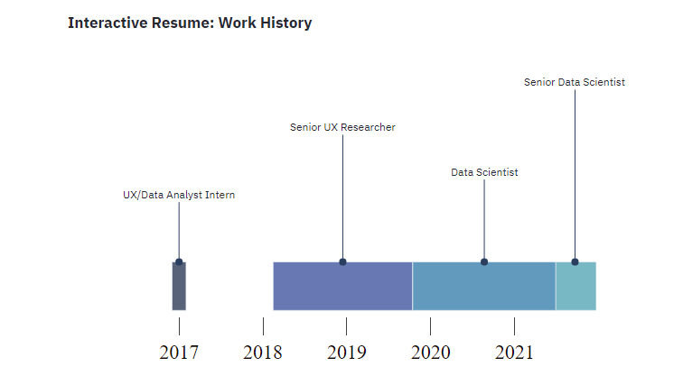
Below is my interactive resume using the code above
">
IFRAME: There is iframe content here but your browser version does not support iframes. Please update your browser to its current version and try again.
</iframe>